How to use this guide
The State Convention of Baptists in Ohio brand is an asset that requires our careful attention and protection. Every one of us, at every level of involvement, is a “Brand Champion” for the SCBO and is charged with the responsibility of using company logos and graphics properly while also encouraging awareness of these standards in others. This page provides principles, rules, and examples for upholding the brand in all aspects of The State Convention of Baptists in Ohio communication.
About the Brand
For The State Convention of Baptists in Ohio, our ‘Brand’ is far more than just a logo and pretty colors. It represents the entirety of the experience that someone has when interacting with our organization. Everything from our logo, website, print media, and advertisements to events, visits to the corporate office, and even conversations with SCBO staff on the phone.
Our Name
When using the organization name on marketing materials and in written communications, please use the following guidelines:
The name may be written in its entirety: The State Convention of Baptists in Ohio
Acceptable abbreviations make use of an acronym: SCBO or the SCBO
The name may be written in its entirety: The State Convention of Baptists in Ohio
- With the exception of the words “of” and “in” all other words should be capitalized at all time
- “The” should always be included and capitalized
- ALL-CAPS should not used, unless approved through the communications department for use on signage or a specific marketing initiative
Acceptable abbreviations make use of an acronym: SCBO or the SCBO
- All letters of the Acronym should be presented as ALL-CAPS with no spaces. Do not use periods after letters S.C.B.O.
- When including the modifier “the” it should be lowercase unless required grammatically.
Logo Meaning
Inviting Churches to Rediscover Gospel Multiplication
The colors and imagery of the SCBO Brand have been chosen to convey stability, strength, and clarity. The chevron conveys the sense that the SCBO is not static or stagnant, but always moving forward
The colors and imagery of the SCBO Brand have been chosen to convey stability, strength, and clarity. The chevron conveys the sense that the SCBO is not static or stagnant, but always moving forward
Our Logo
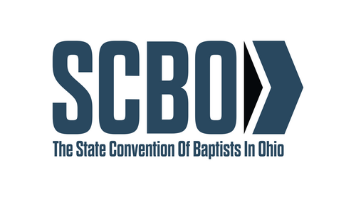
The primary SCBO logo is made up of three distinct components:
- SCBO Acronym
- Right-facing chevron
- Full Text of the Organization Name
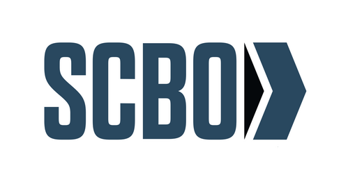
It is acceptable for the logo to be presented without the full text name. This is preferable when the text is not easily read, especially due to size or unusual applications like embroidery.
When using the SCBO logo, it is crucial to keep several design principles in mind:
- The relative height and width of the logo must remain the same; do not squeeze, stretch, add shadows or stroke to the logo
- Other text elements, images, and even the edge of a sheet of paper should never be found too close to the logo
- The SCBO logo should be presented equal in size or larger than other logos in close proximity
- It is also appropriate to present the logo in a monochromatic form in all-white or all-black when necessary
Colors & Fonts
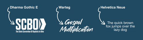
The following colors are used in the SCBO Logo. Whenever possible, SCBO documents and promotional items should utilize the font Helvetica Neue. All variants of Helvetica Neue (e.g. bold, light, thin, condensed) are acceptable. The SCBO logo itself uses a modified form of the font Dharma Gothic E. Additional accent fonts may be used including Dharma Gothic E and Warteg.
Hex: #204a62
PMS Coated: 2168C
PMS Uncoated: 302U
PMS Coated: 2168C
PMS Uncoated: 302U
Hex: #0d171e
PMS Coated: 532C
PMS Uncoated: 5463U
PMS Coated: 532C
PMS Uncoated: 5463U
Additional Resources & Guidelines
Contact Us
Don’t see what you need here? Feel free to fill out the form below with your information and a brief description of your needs.